
How to Choose Brand Colors for Your Enneagram Business (With Palettes for Every Type)

Colors aren’t just decoration — they’re communication. Before a single word is read on your website or Instagram, your audience feels something… and that “something” often comes from your brand colors.
For Enneagram professionals — coaches, guides, teachers, therapists — your brand is an extension of your energy. The work you do is personal, relational, and often transformational. Shouldn’t your brand reflect that?
In this post, you’ll learn how to choose brand colors that feel aligned with you and how to use the Enneagram to inspire your palette. Whether you’re designing a brand from scratch or giving your visuals a much-needed refresh, you’ll walk away with clarity, inspiration, and ready-to-use examples for all 9 types.
Why Your Brand Colors Matter
Your colors set the emotional tone of your brand. They can:
Build immediate trust with the right audience
Help people feel your personality before they meet you
Create visual consistency across your website, resources, and marketing
Reinforce the kind of transformation you offer
The right palette makes your brand feel like home — for you and your clients.
How to Think About Color When You’re an Enneagram Professional
Before we jump into specific palettes, take a moment to reflect:
What do you want people to feel when they land on your site or open your workbook?
What emotional energy do you bring to your client work?
What transformation are you helping people through — and what mood supports that journey?
You don’t have to be “on brand” for your Enneagram type. You might choose colors that reflect:
Your dominant type
Your subtype or instinct
Your ideal client’s needs
Or simply the mood you want to cultivate (e.g., calm, creative, bold, nurturing)
Color Palette Examples by Enneagram Type
Below are nine curated brand palettes designed to reflect the energy and emotional tone of each Enneagram type. You can use these as inspiration or pull exact hex codes to use in Canva, your website builder, or your brand kit.
Enneagram Type 1
Vibe: Refined • Structured • Principled
Palette:
#2C3E50 — Slate; #AAB7B8 — Cool Silver; #F0F3F4 — Soft Gray; #85929E — Steel Blue; #CCD1D1 — Calm Neutral
Ideal for brands that feel clear, trustworthy, and high-integrity.
Enneagram Type 2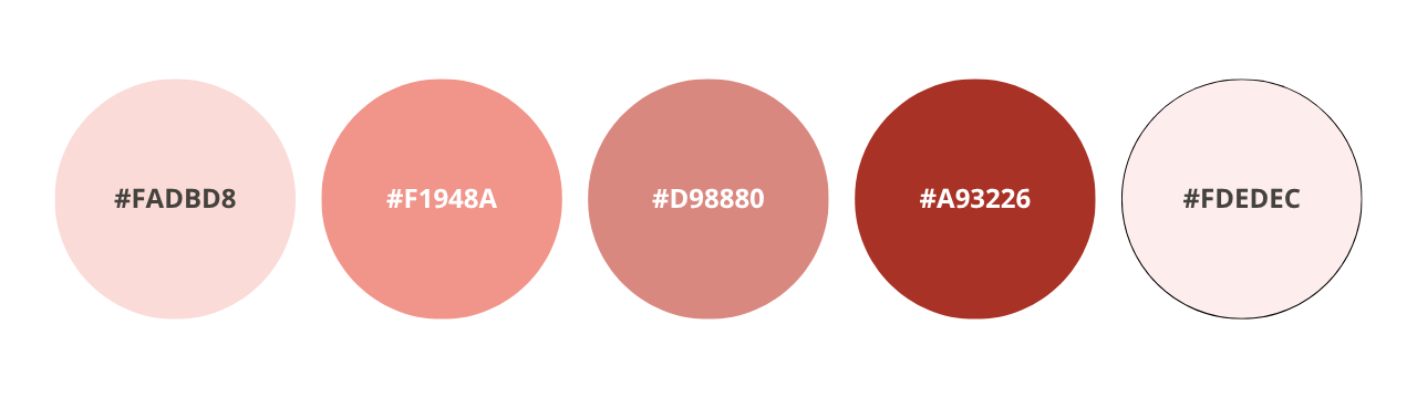
Vibe: Warm • Supportive • Heart-centered
Palette:
#FADBD8 — Blush; #F1948A — Rosy Coral; #D98880 — Terracotta Rose; #A93226 — Grounded Red; #FDEDEC —Light Pink Wash
Great for coaches who lead with warmth, connection, and care.
Enneagram Type 3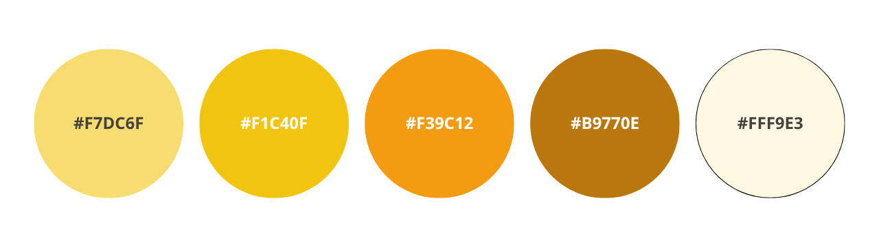
Vibe: Polished • Ambitious • Magnetic
Palette:
#F7DC6F — Golden Glow; #F1C40F — Bright Gold; #F39C12 — Honey Amber; #B9770E — Bronze; #FFF9E3 — Cream Neutral
Perfect for high-impact brands that want to convey success and momentum.
Enneagram Type 4
Vibe: Artistic • Deep • Expressive
Palette:
#7D3C98 — Plum; #BB8FCE — Lavender Mist; #5D6D7E — Cool Shadow; #D2B4DE — Dusty Lilac; #F4ECF7 — Soft Bloom
A fit for brands that embrace depth, feeling, and emotional authenticity.
Enneagram Type 5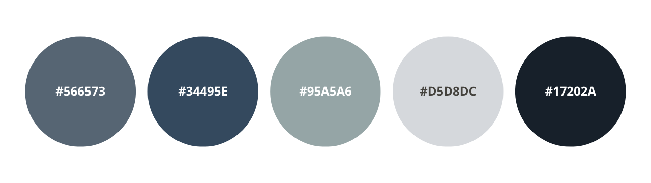
Vibe: Minimal • Insightful • Contained
Palette:
#566573 — Cool Charcoal; #34495E — Ink Blue; #95A5A6 — Soft Slate; #D5D8DC — Gentle Gray; #17202A — Deep Focus
Ideal for thought leaders and guides who value clarity and focus.
Enneagram Type 6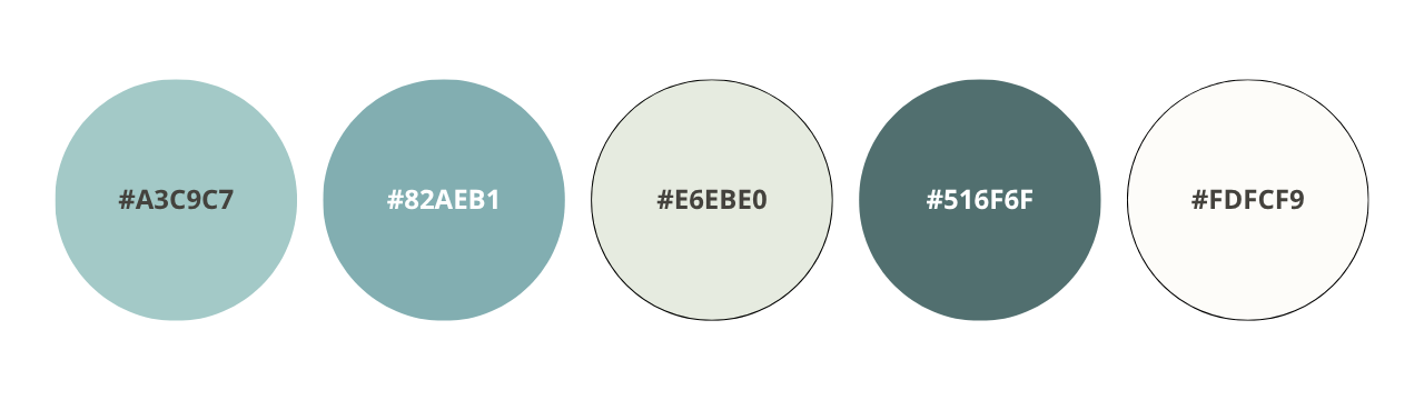
Vibe: Reassuring • Dependable • Grounded
Updated Palette:
#A3C9C7 — Dusty Aqua; #82AEB1 — Muted Teal Blue; #E6EBE0 — Soft Sage Gray; #516F6F — Steady Slate; #FDFCF9 — Gentle Neutral
For brands that are steady, safe, and support-oriented.
Enneagram Type 7
Vibe: Playful • Optimistic • Energetic
Palette:
#F9E79F — Lemon; #FAD7A0 — Apricot; #F8C471 — Sunset Peach; #F39C12 — Golden Orange; #FCF3CF — Light Sunshine
A joyful palette for bold, fun-loving brands with positive energy.
Enneagram Type 8
Vibe: Bold • Strong • Commanding
Palette:
#C0392B — Power Red; #922B21 — Deep Burgundy; #E74C3C — Flame; #F5B7B1 — Dusty Rose; #641E16 — Authority
Great for leaders with strong presence and big mission energy.
Enneagram Type 9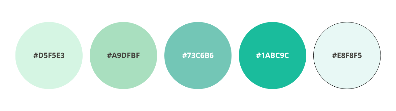
Vibe: Calm • Receptive • Gentle
Palette:
#D5F5E3 — Mint Mist; #A9DFBF — Soft Sage; #73C6B6 — Ocean Green; #1ABC9C — Seafoam; #E8F8F5 — Tranquil Light
Lovely for nurturing, grounded brands that want to soothe and guide.
How to Use These Colors in Your Brand
Once you’ve chosen a palette (or built one inspired by the above), here’s how to use it consistently:
Add your hex codes to your Canva Brand Kit
Use your primary colors for website buttons, headings, and graphics
Use neutrals and accents for backgrounds, highlight boxes, and social templates
Stick to the same 4–5 colors across platforms to build visual trust
But What If the Colors for Your Type Don’t Feel Right?
You don’t have to brand strictly “by the book.”
Color is about energy, not identity.
Instead, consider:
What your clients need to feel safe and inspired
What energy you want to step into
What supports your message and mission
This isn’t about boxing yourself in — it’s about bringing visual alignment to what you already know deeply about yourself.
Want to Create Your Own Color Palette?
If none of the example palettes feel quite right — or if you’re feeling inspired to design your own — there are some easy-to-use (and fun!) tools that can help you experiment with color combinations.
Here are a few favorites:
Coolors.co: Quickly generate and tweak custom palettes. You can lock certain colors and shuffle the rest until it feels right.
Adobe Color: Build color schemes based on color theory, harmonies, and even imported images. Great for creatives who want more control.
Canva Color Palette Generator: Upload a favorite photo and get a palette based on its tones. Perfect if you already have a mood board or brand vibe in mind.
Pro Tip: Choose 4–5 main colors for your brand:
1–2 primary colors (the stars of your brand)
1–2 secondary colors (accents and support)
1 neutral (for backgrounds, body text, or balance)
And remember: your palette doesn’t have to be loud or trendy. It just has to feel like you — and support the message you want your business to send.
Final Thoughts
When you choose colors that feel like you — and stay consistent — you create a visual experience that builds trust, connection, and credibility. Whether you lean into your type’s palette or find your own path, your colors should support your work, not stress you out.
Want help building a visual brand that reflects your type and your message?
👉 Your energy is unique — your visuals should be too.
My Branding Package helps Enneagram professionals align their look with their message.
You’ll leave with a tailored palette, font pairings, a cohesive mini style guide, and more. Learn more here.